Add a chatbot to your website
This guide will walk you through steps to add a web widget (to your website) for any chatbot created on the Gupshup platform. Widget publishing tool (as shown in the below image) allows you to customize the look and feel of the widget also, get you the widget script which can be embedded onto any website.

Here's how you can do so:
- Create a bot using Gupshup's Bot Builder tools. If you aren't familiar with this, You may refer to A 'Hello world' bot guide for developers or Flow bot buider guide for non-developer.
- Once the bot is created, go to the 'Publish' section. Every bot in the 'My Bots' section has an corresponding 'Channels' button. Click it to go to the publish section.

- From the list of channels click web widget's 'Publish' button.

You should see the Web Widget configuration page where you can customize the visual details of the web widget. Detailed explanation of the options for customization are given under Customization Options section below.
- Once done with Widget UI customization, click 'Save' button to save your settings. Thereafter, click on the 'Get Code' button to copy the script tag and paste it into the source HTML of your web page. That's it! you are done with adding widget for the bot on the website.
Here's a sample HTML code as a reference:<HTML>
<HEAD>
<script id="gs-sdk" src='//www.buildquickbots.com/botwidget/v3/demo/static/js/sdk.js?v=3' key="2bxx79xx-0dxb-4xx4-ac71-x4a42xxxxxxx"></script>
</HEAD>
<BODY>
<h2> hello world! </h2>
</BODY>
</HTML>
Customization options
Following are the options to customize the visual details of the widget:
Tab 1: Open Mode
- Title to Bar - The text at the header of the widget when it is maximized.
- Height - Height of the widget when maximized.
- Width - Width of the widget when maximized.
Tab 2: Close Mode
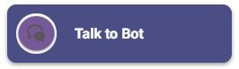
- Select widget button style - Shape of the widget when minimized

Circle |
|
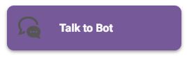
Rectangular |
- Title bar text - The text at the header of the widget when it is minimized.
- Width - Width of the widget when minimized.
Tab 3: Common
- Logo - Upload a custom logo to be displayed in the header of the widget
- Logo Image Display Type - Shape of the logo in the header of the widget. The two options are circular and rectangular.
Circle |
|
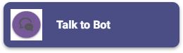
Rectangular |
- Title bar background color - Used to change background color of title bar. Note* Widget theme is based on the color you choose for widget title bar, meaning message templates(button), persistence menu, attachment icon and others, color will be same/contrast to whatever color you choose for title bar
- Title bar font size - Used to change font size of the text in title bar
- Title bar font color - Used to change font color of the text in title bar
Tab 4: Content
- Bot icon - Upload a custom bot logo to be displayed for bot messages
- Bot bubble Color - The background color of the chatbot's messages
- Bot font Color - The text colour of the chatbot's messages
- User bubble Color - The background color of the user's messages
- User font Color - The text colour of the user's messages
- Font Size - The font size of the messages in the widget
- Page title text in mobile view - When a widget is loaded in a mobile webview/browser the title set here will be the title of the browser tab.
- Widget background image(Enter URL) - Set a wallpaper to chat conversation box
- Conversation font size - Set the font size of the user/bot message in the conversation box
- Font familytype - Set font style - Google font family are supported
- Enter font url if not available - In case if you want to use custom fonts - paste the hosted link in this text box
Tab 5: Developer Options
- Enter valid JSON for persistence menu - Enable persistence menu by providing a valid persistence menu JSON
- Persistence menu image URL - An optional field, used to change persistence menu icon, recommended image dimension - 32px X 32px
- Enable attachment option - Provides an file attachment option to the user
- Select the widget channel - Widget can be of type Text, Audio and Video. By default it is of type Text
- Text - This channel supports plain text, rich media and templates
- Audio - Along with support for plain text, rich media and templates this channel, accepts voice input from users. You will notice a microphone icon in the web widget which indicates that it supports voice input
- Video - This channel supports a video-only implementation. This means that all the bot responses are in a video form only. In this case the videos are embedded into the chat window.
- Enable message encryption - Message are end-to-end encrypted
- Open URL in webview - Opens a link in the widget itself(webview)
- Allow HTML text from bot response - Enable to render HTML text in the widget
- Message read and delivery status - Enable to read/delivery receipt
- Make Widget Responsive - Option to make the web widget mobile responsive
A web widget on a sample HTML page is shown below:
